Please don't make me think!!
Concur, Why do you require the Cognitive Switch?
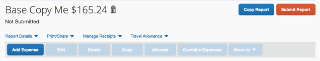
I woke up the other morning and had to fill out my quarterly expense report. During that process, I got to a state where I thought it would be best to delete the report and start over. I first quickly scanned the page looking for a delete button near the very bright and colorful “Copy Report” and “Submit Report” buttons. Not finding it there, I began to quickly scan drop downs and did not find it. Next, I went back a page and looked at the list of expense reports in the hope I could check it, and then click a delete button. With no joy with that activity, I was getting increasingly frustrated, my blood pressure was rising, and I was cursing the developers of this page. Clearly this page had not been tested with any humans that were new to this activity of deleting an expense report. Since I am passionate about human factors in software, cognitive frictions that cause toil drive me crazy.
After getting very frustrated I went back to the expense page and did command-f to search for the word “delete”. Of course, the only “Delete” I find, was the greyed out one. At this point my mental patience had been significantly used up, and I was getting increasingly angry at both my inability to find a way to delete my report, and with the developers, that seemingly missed the development of this feature.
After taking a breath, I finally noticed the icon of a trash can. I clicked it and was prompted with a popup to see if I wanted to delete the expense report. Oh my, I could not believe my eyes. The implementers of this page, had asked me to mentally switch between words and icons in the context of the same kind of activity. I had lumped in Copying and Submitting a report with Deleting it, and assumed that I could find a “Delete Report” button somewhere nearby. While this was a few weeks ago, it is still fresh in my mind. This seconds-long activity had taken me nearly 15 minutes to figure out, and had created a ton of invisible unplanned work. It also ruined the rest of my day, because it had used up my patience. Please note that our ability to reason and think is negatively impacted when we have to think too hard.
I don’t have access to the old system, but I do remember finding it hard to copy an expense report in the past, to enable having a base report for the typical types of expense reports I have to make. I am wondering if these features (copy and delete) have grown over time, and were implemented at different times by different teams. With the mental switch between Icons and Words, I think it is safe to assume that no end-user testing was done on this feature when either copying or deleting was added.
Utilizing Fitt’s law, which describes how hard it is to move your mouse to hit a target, to analyze this headache. The Delete Icon and the Copy and Delete Report buttons are separated by a ton of whitespace, Fitt’s law suggests that this distance, and the context switch of an icon vs a button, greatly increase the time to successfully complete this task. In fact, in my case, it was nearly impossible, until I learned the trick. You never want to make your users feel dumb, but that is exactly what this exercise in frustration did to me.
Mockup 1:

Mockup 2:

Please let me know if you like one or the other. Feel free to connect on Twitter, Facebook, or LinkedIn.
If you are interested in learning more about Feedback, Friction, Toil, and Invisible work.
Please check out Module 6, Feedback, Friction, Toil, and Invisible Work from ‘The Foundation’.
‘The Foundation’ encompasses 6 modules every developer should have around human factors in the context of software. We have a usability crisis with software and ‘The Foundation’ gives you tools to think about how to identify and address it.
FEEDBACK · FRICTION · TOIL · INVISIBLE WORK
design fitt's law